Saul Bass once commented that his work is cantered around the idea of being able to Symbolise and Summarise — attempting to reduce often complex themes or ideas to their simplest parts yet still have the message come through so the person viewing it can get a sense of that theme or idea very quickly, in a visual way.
Can we approach the exploration of big data in the same way — creating a visual summary, distilling many parts into one visual form?
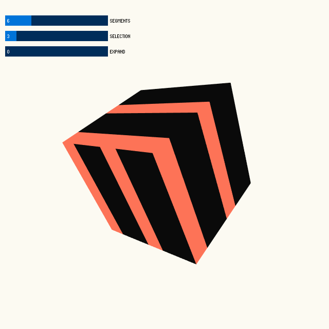
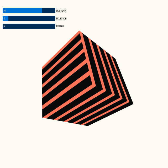
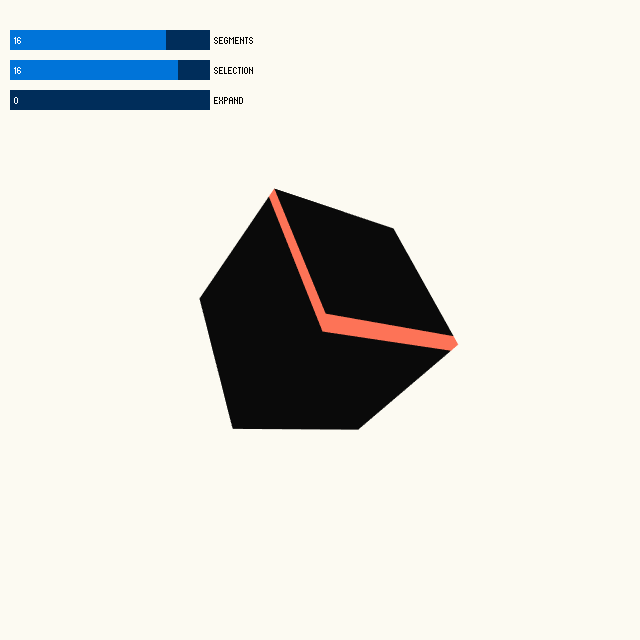
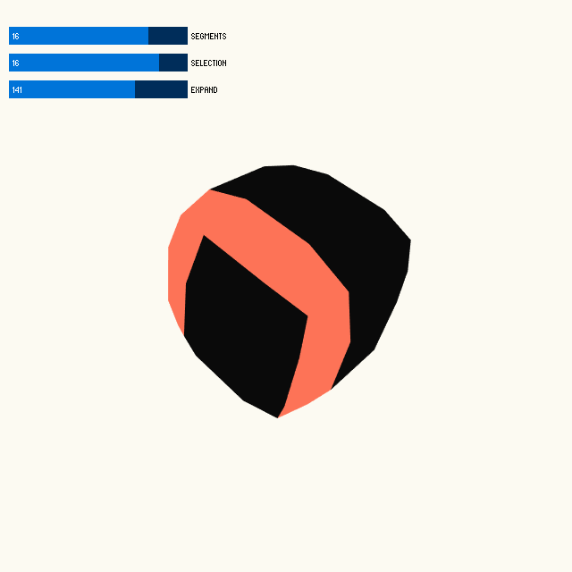
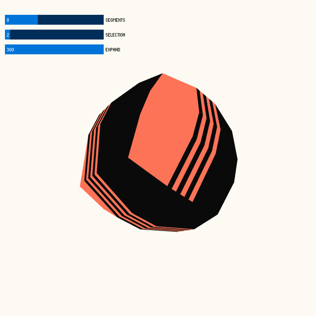
In this example I take a simple 3D cube and using just two colours, split the faces of the cube and then select various faces to create patterns. This cube might be a visual summary of a dataset. The more selected segments that are shown might suggest it contains more of the things you’re after, or large grouped segments might suggest that contained in this dataset are very specific things, maybe after the user has filtered the dataset in some way. Do the patterns create a visual grammar that the user could come to understand — “Oh I know this pattern tells me X”.
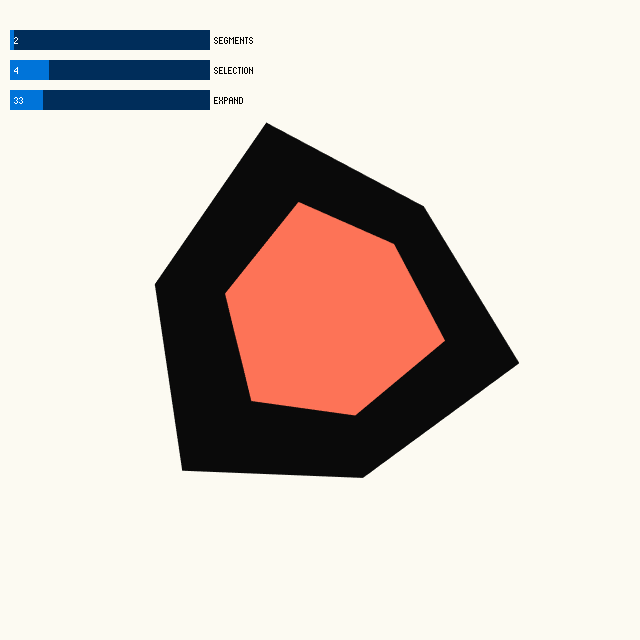
Then there’s the use of “bloat” as a visual metaphor for that dataset or selection of that dataset being full with maybe a filtered result. Visually it looks more full with information than the non-bloated versions. Is there a way to use this as part of a visual grammar?